

PRODUCT DESIGN
Solace
Dashboard
Design System
Health Tech
MY ROLE
Product Designer
TEAM
Design Lead
1 Designer
3 Product Managers
4 Engineers
TOOLS
Figma
Staging Website
TLDR;
SOLACE pairs patients with health advocates who help handle the logistics of care, which can range from organizing insurance calls to coordinating other events like surgical procedures and physician follow-ups.
However, patients have no way to view any of their upcoming care. Advocate calls and outside appointments existed in separate places with nothing that can help connect them in any way.
The Care Calendar helps consolidate both. I designed the event card system, along with its entry point on the patient dashboard.


CONTEXT
The Purpose of Solace
Solace pairs 220k+ active patients with health advocates who schedule appointments, communicate with doctors, manage insurance appeals, and organize medical records on a patient's behalf.
Patients are kept current on all of it. Advocates walk them through it on calls. Care notes and transcripts are there to refer back to, and the patient is also able to keep in contact with their advocate through Solace's messaging system.

•
THE PROBLEM
Care Has Been Scattered Across Places
A patient normally has many different events—appointments, surgical procedure, incoming calls—that they may need to prepare for ahead of time or keep track of. There's no clear transparency on either sides of the advocate or patient where they can view anything that's upcoming.
Because there's no way to keep track of anything, there's always the risk of a call being scheduled at the same time of an existing appointment, or an upcoming event being missed.
WHO IS BEING IMPACTED:
Patients
PRIMARY USERS
No forward view of their own care, and no single place holding Solace visits alongside outside appointments.
Advocates
SECONDARY USERS
A calendar of every patient they manage, but no shared reference with the patient.
OUR PLAN
Our team's answer was a Care Calendar: a hub that can hold both internal and external events.
•
THE PROCESS
Building the Calendar
I worked with my team to create the Care Calendar from scratch. While they worked on the flow and layout, I had to figure out what fills it.
•
THE PROCESS
I incorporated Event Cards with a cohesive color and typography system,








Solace Events
External Events
•
THE PROCESS
& the Pop-Up that opens when a patient selects a specific card.
•
THE PROCESS
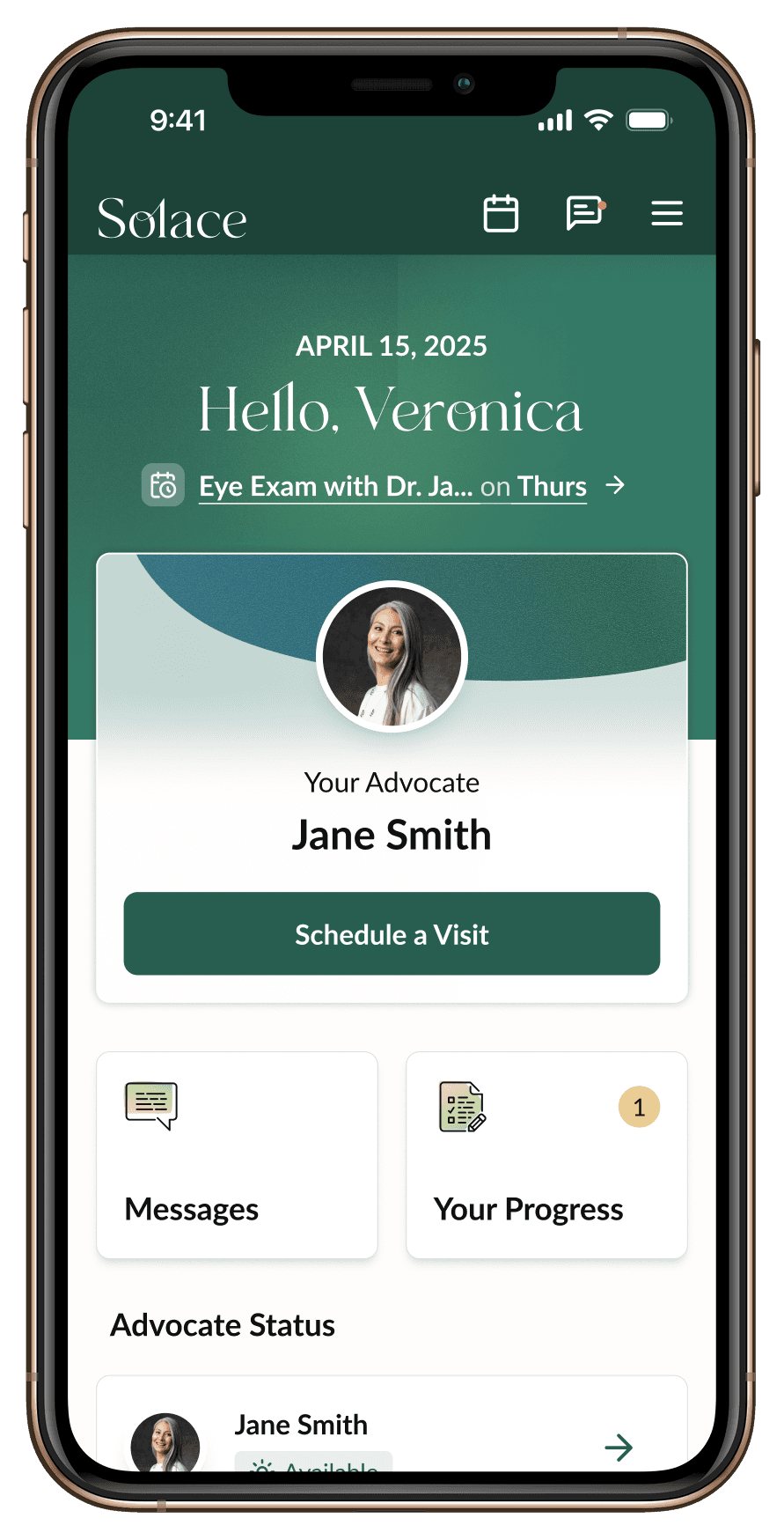
Figuring out a Door to the Calendar
The Care Calendar is a destination point, and destinations only work if people are able to arrive there from the main Dashboard.


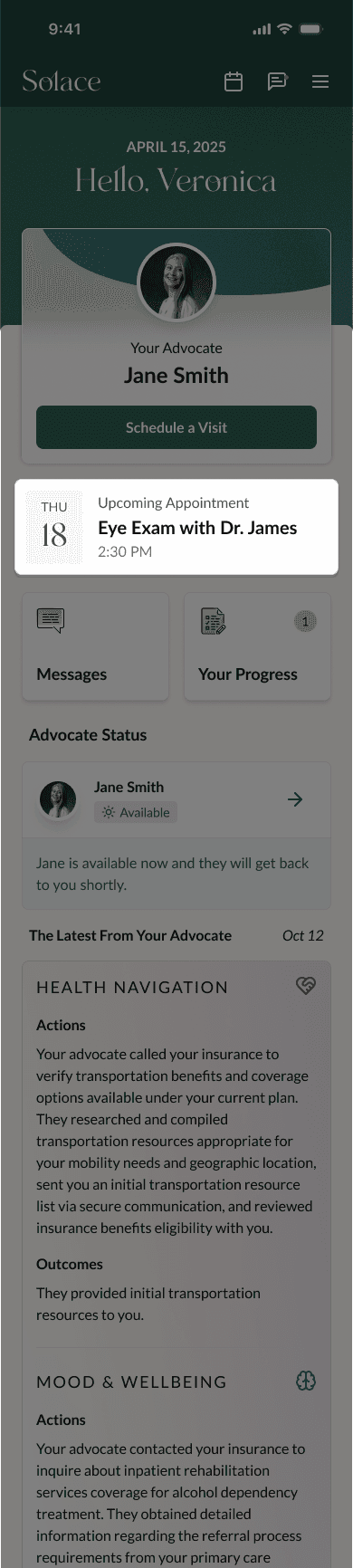


The date and greeting at the top of the page were already there and did not carry heavy visual weight. I decided to place the event line inside that block, adding information without adding any unnecessary structure.
•
THE FINAL PRODUCT
The Shipped MVP, from Start to Kick-Off
THE IMPACT
The Care Calendar is Live
The Care Calendar feature has been successfully shipped patient-wide at solace.health.
I took the feature from kick-off and concept review through detailed design and documentation, and supported the development team through the early build before transitioning out due to company-wide layoffs.
REFLECTIONS
Understanding the scope
One of the versions that we liked couldn't be built. Knowing what my team can and can't ship in the time available is a real constraint, and designing for something within scope for engineering is very important to consider.
Collaboration is growth
Product design lives just as much inside the conversations and tradeoffs as it does in the file. Each round of feedback was a chance to ask better questions and pull the design into somewhere stronger.