
INTERNSHIP
FAIshion
Web
Chrome Extension
Try-On
MY ROLE
Product Designer
TEAM
1 Designer
1 Product Manager
2 Engineers
TOOLS
Figma
Gemini AI
TLDR;
FAISHION.AI is an AI styling tool that allows users to visually "try on" clothing items online, mix and match outfits, and get personalized feedback from a virtual stylist.
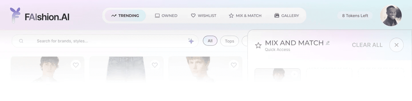
I worked with my team to design their recent feature release, Mix & Match. This feature allows users to combine different items of their choosing, and generates a realistic preview of the full look on the user. I designed the UI from scratch and conducted research to create a flow that is cohesive to the Try-On function and easy for the user to navigate through.

THE INTIAL BRIEF
Initially, we only wanted to create an outfit builder centered around the Recommendations page.

FIG. 1
INITIAL ANALYSIS FROM FIRST WEEK
•
THE PROBLEM
Upon further research, we decided to take it up another notch and evolve the concept by integrating AI into the feature.
Our previous approach relied heavily on users’ ability to visualize the final look. However, it's difficult to coordinate and plan outfits without trying everything on. This can lead to users experiencing these different pain points:
What you picture in your head can be completely different to what it actually looks like when you try it on.
Clothing items come from sites with different models, lighting, and styles, making it hard to guess if anything matches.
Coordinating outfits requires you to physically swap through clothing items, which can become redundant and tiring.
This friction can be enough for users to avoid experimenting with different combinations and delay purchase decisions if they are unsure about the results.
•
THE PROCESS
Visualizing the Journey
Through research online, I noticed that users approach outfit creation through 2 distinct pathways:
01.
Intentional Styling
where they actively build an outfit.
02.
Passive discovery
where they save or collect items while browsing.

FIG. 2
Based on the two pathways, 2 Mix & Match entry points will be integrated that the user can access interchangeably:
The "Shopping Basket" will be accessed through already existing pages.
The standalone page will have the same functions, but can be accessed through the navigation menu.
RESEARCH
I audited different layouts from outfit builders and generative AI tools.
Comparing them side to side highlighted three core needs that need to be prioritized: visibility, flexibility, and control. This led to the first design iteration, created using Gemini AI to decide on the initial flow. After some tweaks, our team had a good idea about what to build and how we can integrate the feature into the site.

FIG. 3
OUR COMPETITIVE ANALYSIS


FIG. 4
SOME OF THE (MANY) VIBE-CODED EXPLORATIONS
•
THE FINAL PRODUCT
The Full Look
Three surfaces carry a user from browsing to a finished look: a lightweight basket for collecting items without breaking their scroll, the full Mix & Match workspace for building deliberately, and a gallery for revisiting what they've made.

STANDALONE

"SHOPPING BASKET"
Feature Priorities of the Map
MAIN FEATURES
EDIT TITLE NAME
ADD ITEMS
WRITE PROMPT
SUBMIT/GENERATE
ENTRY POINTS
STANDALONE PAGE
"SHOPPING BASKET"
THE INTERFACE
#1: The Shopping Basket
A quick-add panel available from every browsing page, so a user can start building a look the moment they spot something without having to navigate outside of the page.
#2: Mix and Match Workspace
Five labeled slots, an optional scenario field with AI-suggested prompts, and a live picker so users can swap pieces without losing their place.
#3: The Gallery
Every generated look is saved and searchable. Users can filter by mood or occasion, or recreate with new pieces.
OUR NEW DESIGN SYSTEM
A Reinstatement of the Old
The stakeholder preferred to keep the Inter font and pastel color scheme. I rebuilt and created a more cohesive design system that can help unify the overall site while staying in scope with the brand colors.
Instead of completely revamping the colors, I pushed to add subsidiary colors that can compliment the main color schemes and font family.
TYPEFACES
Aa
Inter
Aa
Montserrat
BRAND COLORS




THE IMPACT
The Live Feature
The Mix and Match feature has been successfully integrated into FAIshion's website as its own web app here. This release was anticipated by 78% of the 800 total participants in a user feedback survey.
REFLECTIONS
Developing a good eye
I realized how important it was to gain a good understanding of the design system. The goal is to build within it, not around it. In order to advocate for additional brand guidelines, I had to familiarize myself with what is already there.
AI shortens the loop, and taste closes it
Being able to vibe-code different layouts quickly gave me a much clearer picture of the overall structure. I could see five versions of an idea instead of imagining one. However, AI didn't replace the design thinking; it simply allowed me to explore more options and iterations.